A Star Is Reborn: Mobile Expenses App Makeover

Five years ago, there was nothing hotter in enterprise software than mobile apps. Every vendor simply had to have one.
That’s still true today, but mobile has matured since then, and we’ve learned a lot about design and best practices. That’s why, as we considered new feature requests for the next release of our mobile expenses app, we decided it was time to give it a complete makeover.
We took those feature requests, dug deep into our data and came up with some hypotheses on how we could make it better. Then we pulled together a panel of users to use our app and try our new design. Some of our hypotheses were confirmed, and we also made a surprising discovery that took us in a whole new direction. Our “marigold” release was unveiled as part of release 18 at Coupa Inspire in May. Here’s the story of how it came to be.
Not ‘wow’ enough
We’ve had both an iOS and an Android app for many years, and have been constantly upgrading and adding to both. We’ve gotten some recognition for several unique features in our iOS app--namely voice expensing--and SmarterTrip, which is a feature that allows you to use your smartphone's GPS to automatically track mileage and other expenses that happen throughout your trip.
We felt that while the apps were solid and functional, they were short on “wow” factor. They also felt a little dated. We thought that there was an opportunity to make it a lot more streamlined, appealing and user friendly.
Why does it matter? Well, the number one use case for a business expense app is capturing receipts and expense information while you’re on the road. A well-designed mobile app should become indispensable, supporting faster turnaround of expenses and a better experience for travelers.
But, if your app is blah, you're probably losing users who don’t find it compelling and memorable. If the user experience isn't streamlined, they may think, "You know, there aren't a lot of advantages to using the mobile app. I might as well wait until I get back home.”
The self-critique
Looking at all the wonderful consumer apps that have come out over the past five years, we couldn’t help but wonder if that might not be the case with our app
It had a very busy toolbar at the bottom of the screen with five different ways to create an expense report. You can see how we were looking to recreate the desktop, and give users lots of different choices.
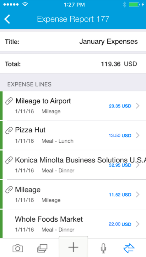
Looking at it today, the problems with that jump out immediately. When you jam five choices at the bottom of a mobile screen, those icons are very small and there’s no room for description. The user has to figure out what they mean. And, you’re not bringing the best methods for capturing expenses to the forefront. You're treating them all equally, and that’s not helpful.
I think with early apps, there was a lot of, shall we say, exuberance, and that led to a tendency to overload them with functionality. Today’s apps are much simpler. They treat mobile as its own medium, not a mini-desktop. They don’t clutter the screen. They make the main tasks very prominent and de-emphasize the activities that are more occasional.
That was our self-critique, but before we started building, we wanted to get user feedback. We also wanted to look at our data.
Studying the data
We used reporting tools platforms to see how thousands and thousands of people were using the app, and confirmed our hypotheses that there were significant improvements we could make to the user experience.
For example, we noticed that a surprising number of users were picking the manual mode of creating an expense line. That seemed counter-intuitive. You'd think people would want to use their voice, or snap a receipt picture – anything to avoid tapping on their smartphone keyboard.
We thought that was probably because it was the middle most button of the five, and with a big + sign on it. Its probable function was clear, whereas the others were less so. We were unintentionally steering people in that direction, even though it wasn’t the best user experience.
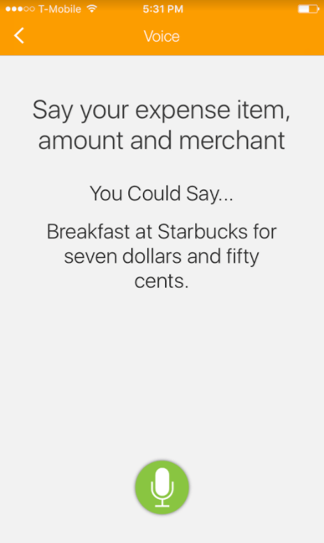
Our data also showed a lot of people clicked an microphone icon to begin dictating an expense, but then exited out. The way it was set up, the app would start recording your voice immediately, which gave users no time to prepare themselves. Our guess was that people needed more handholding as to what exactly they should be saying, and more control of when to start dictating their expense.
Finally, we wondered if we were serving people who just wanted to do the bare minimum. When you’re on the road, you may be running between meetings. You may have a carry-on in one hand and a latte in the other. You may not want to complete the entire expense line all the way down to custom field information right then and there. You may want to capture the receipt or make a note about the expense and then deal with it later.
There wasn't a way to do that. The app was set up with the assumption that you were there to complete an expense report, just the same as on the desktop version. So, it was all or nothing.
Bringing the users
With those ideas in mind, we brought in a diverse group of users--frequent travelers, admins, corporate card users and expense approvers. Some of them were not even Coupa customers, and had never seen our app before.
We had them walk through our current mobile app and perform common tasks. We asked them to verbalize what they were thinking, and particularly to call out when they were confused or unsure what they were supposed to do next.
Then we had them walk through some prototypes that we developed and give us their feedback.
Little by little, patterns started to emerge, many of which supported our hypotheses. What really surprised us though, was the emergence of two distinct traveler personas: The “now” persona and the “later” persona.
The new persona
We had suspected some people wanted to do just the bare minimum and deal with it later, but we had no idea how many, and that it was a lifestyle choice.
We saw that some people were very keen on doing their entire expense report line item by line throughout their trip, in real time. These ‘now’ people wanted to be able to submit their expense report the minute they walked in the door at home and be done with it.
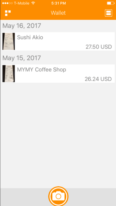
The ‘later’ people just want to snap pictures , or at most enter basic details about their expense, and deal with it later. It was roughly a 50-50 split between “nows” and “laters,” so we realized we needed to build a great user experience for both.
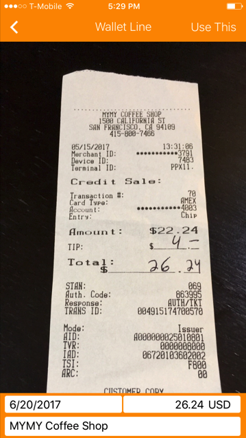
We created an Expenses “Wallet”, a holding area where you could store receipts and basic information about them and then later organize them into a report and submit it. We also added a Receipt OCR (optical character recognition) feature so users could snap a picture and Coupa would automatically fill-in key details about an expense. Now, users can spend a couple of seconds on an expense, and it will be there waiting for them when they are ready to do their report.
Finding their voices
We confirmed our hypothesis that users do not want to type, but were defaulting to that option because of the way the screen was set up. They were very interested in using voice commands, and we were right: They did need a little help with it initially, and didn’t like that it started recording right away.
In the new design, we added an interim screen, which explains the process and cycles through some examples of what to say. Then there's a start button so that you control when you start speaking.
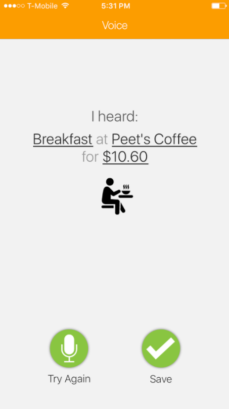
We also added a confirmation screen that says, "Here's what we heard." It feeds back what they said, and underlines the keywords that will be entered on report fields. If it’s right, which we’ve found it is about 95 percent of the time, you click save and it adds an expense. If not, you can have a do-over.
Highlighting What’s Important
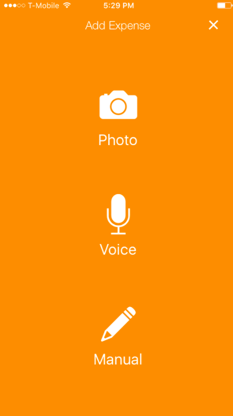
Based on user feedback, we wanted to make it a lot easier to discover the most useful ways to create an expense. Rather than crowding five icons at the bottom of a screen, we added a new, beautifully simple screen that highlighted three ways to add an expense to a report: Taking a picture of a receipt, using your voice to dictate an expense, and entering an expense manually.
Helping approvers
We also put some thought into mobile approvals, since that’s the most popular activity after adding expenses.
The feedback we got from approvers was familiar: Less information is better. We changed the app just to present the amount of the expense report and the Coupa expense report score. The closer the score is to 100, the lower the risk. On high scoring reports, amounts are within benchmarks and receipts are attached. You don't need to spend any more time on it. You can click approve and you're done. If the score is lower, detail is available, and you can drill down if you need it.
The other thing they wanted was push notifications to let them know when a report was pending approval. Done!
Those were the marquee outcomes from the mobile redesign. The cherry on top is a total color overhaul. There's a tendency sometimes in enterprise software that you want your product to look very professional. So sometimes that can lead to a dry, boring product that people don't gravitate toward. So, we switched from our corporate-y gray, blue, and white color scheme to beautiful warm orange tones. We jokingly call it our marigold release. It’s a bit of a risk, but we feel like it complements the appeal of the new features.
My takeaway from this whole process is that particularly on mobile, there are new learnings and best practices that are being created out there in the market every day.
If you let your mobile app stagnate for more than a couple of years, it is going to quickly get outdated and it's going to disappoint users. The best way to discover that is to talk to actual users. As a product manager, you often get so close to the product that things may seem obvious to you but they're not obvious at all to people who are not working with your product every day.