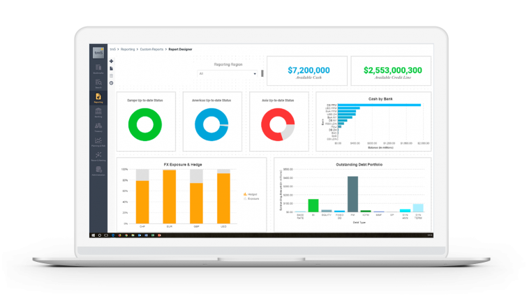
Building a More Targeted and Effective Report

When creating a treasury report, it can be tempting to just present data. After all, it’s hard to argue with data. But it can also be hard to create convincing arguments with only data. When you do, your audience becomes overwhelmed. With no context to attach this data to, they easily forget figures and fail to grasp why they are meaningful. This is why creating a more targeted and effective treasury report is all about telling a visual story. Here are 8 ways in which you can improve your presentation and ensure your data translates to successful business decisions.
Decide if your report is author-driven, reader-driven, or both
An author-driven presentation is one with a single linear path through the data, a strong message that includes very little interactivity. Some examples might be a stage presentation or training. In contrast, a reader-driven presentation has no order to the presentation of data, and very little in the way of message. However, it may be very interactive. Some examples may include treasury analytics, or reports that are provided in interactive form (e.g. spreadsheets). Of course, there’s also a combination approach. It depends on your audience and its needs, as well as the data you’re presenting, which approach makes most sense for you.
Think about your audience
Do consider what you want to convey, how, but most importantly to whom. When you assemble data for a treasury report, some of your main considerations are your audience and its needs. Is this a presentation for decision-makers? A report for managers? Any visualization you create needs to be produced with an understanding of the level of information your audience has and expects:
- Managers need actionable, in-depth understanding of the intricacies of the subject, and will likely want access to detail.
- Executives only have time to glean the significance and conclusions of weighted probabilities.
Your treasury report needs to reflect these preferences and requirements:
- Do offer managers options to dive deeper and give them the complete picture, while still breaking it down in a way that will help them focus on what’s important.
- Keep it focused when addressing executives and make sure your guidance and recommendations are clearly highlighted.
Use a story archetype to structure your information
In general humans are awful at remembering facts. A study from Stanford showed that people retain structured information up to 40% more reliably and accurately than unstructured information. When structuring your information, ask yourself:
- Is your data an exploration of a troubling or threatening event?
- A contrast of a potential market with your target?
- A look at a new idea or approach?
Believe it or not, these all correspond to common story archetypes, and those can give you a hint at how to structure the data you’ve already produced into something more memorable.
Use characters in your treasury report presentation
People care about people. In a presentation, it can be helpful to refer to the people involved in the presentation and/or responsible for the data you’re discussing. By this I don’t mean that you should tell the story of Jill in Accounting, but you can integrate characters by choices like highlight the role that your teams played in your presentation.
Keep consistent visual semantics
Maintaining a visual “language” across your presentation is important. Again, this provides structure and helps guide your audience. They can see quickly how information is connected, which sections deal with which data, and what is important. Visual semantics can include:
- A consistent use of visual highlighting (color, size, boldness)
- Semantically consistent color encoding
- Maintaining similar placement of items
You want to make it as easy as possible for your audience to navigate your presentation and to draw conclusions that are relevant to their needs. There is no better way to do that than to be consistent, clear and precise in how you present your data.

Annotate your visualizations
Annotations provide a context for the data you present, giving further details or interpretation of the information you’re providing. In some contexts, this might mean “details-on-demand” – with more information appearing when one interacts with that particular element. Annotations help prevent ambiguity and enhance understanding of a topic. As discussed earlier, this is particularly relevant when reporting to managers.
Cut cut cut: break it down to the really relevant information
Think about your presentation as signal and noise. Your audience needs to navigate its way through this information to get to what they really need.
- What is it that you’re really trying to get across? That’s your signal.
- If something you say doesn’t add to that, it introduces “noise”.
Look at each thing in your presentation and ask yourself if it supports what you want to achieve. Avoid cutting signal though: a good visual presentation should stand on its own, providing enough information to understand what it’s trying to get across without needing someone to explain it.
Creating a better report means building a better visual story
Crucial to creating effective presentations is your ability to create a visual narrative out of your data. This requires a consideration of who you’re presenting to, a narrative approach, taking steps to limit ambiguity, maintaining a visual language, and separating signal from noise. In doing so, you create a presentation that will be remembered and can be translated to decisions that benefit your business.
Want to learn more about our powerful treasury solutions? Time to discover Coupa Treasury.